Age is the mechanism, not the subject
The question that started this was not a design question. It was: if I post this somewhere today, will anyone care — and if they open it, is it useful? The honest answers were no and yes, in that order, and they turned out to require completely different work. What followed was a rebuild, a critique that said the rebuild had overshot, and a second pass that pulled it back.
Two failures that look like one
“Nobody is coming” and “the people who come do not stay” feel like the same problem. They are not, and treating them as one produces work that fixes neither. Thirty days of the site’s own analytics separated them cleanly:
| Metric | Value |
|---|---|
| Visitors | 33 |
| Sessions | 50 |
| Average session | 4 min 49 s |
| Pages per session | 6.1 |
| Bounce rate | 52% |
Thirty-three people. Nearly five minutes each, six pages deep. That is not a bounce-and-leave site — it is a site almost nobody has been pointed at, which holds the people who find it. As problems go, that is the cheaper one to have. Most products in this position have it the other way round: traffic arriving at something that cannot hold it, where more traffic just means more people leaving.
Then the event counts, which were harder to look at:
job_click      9   ← clicks out to an employer's board
listing_view   1   ← views of a fable12 job page
listing_apply  0
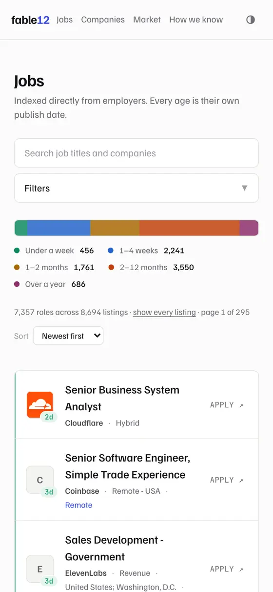
Nine departures, one page read. The best page on the site — the one that puts a listing’s age in context against its employer’s other roles — had been opened once in a month. Not because it was bad, but because the only route to it was a small age badge on the far right of each row that reads as a status pill rather than a link. The title, the obvious thing to click, went straight off the property.
The reach half was similarly self-inflicted and similarly cheap to fix. Four of five page types shipped no share image at all, so the pages you would actually post rendered as a grey text stub — while the one page type with a proper 1200×630 card was the one nobody shares. /market additionally reported the homepage’s title, description and canonical URL, so sharing it described a different page. And there was no feed, no alerts, no saved search: /rss.xml, /feed and /alerts were all 404. Someone could read for five minutes and have no mechanism to come back tomorrow, which is exactly when the next sweep would have something new for them.
Round one: make age the subject
The diagnosis underneath almost every finding was the same. fable12 knew something no other job site knows and was treating it as a decoration:
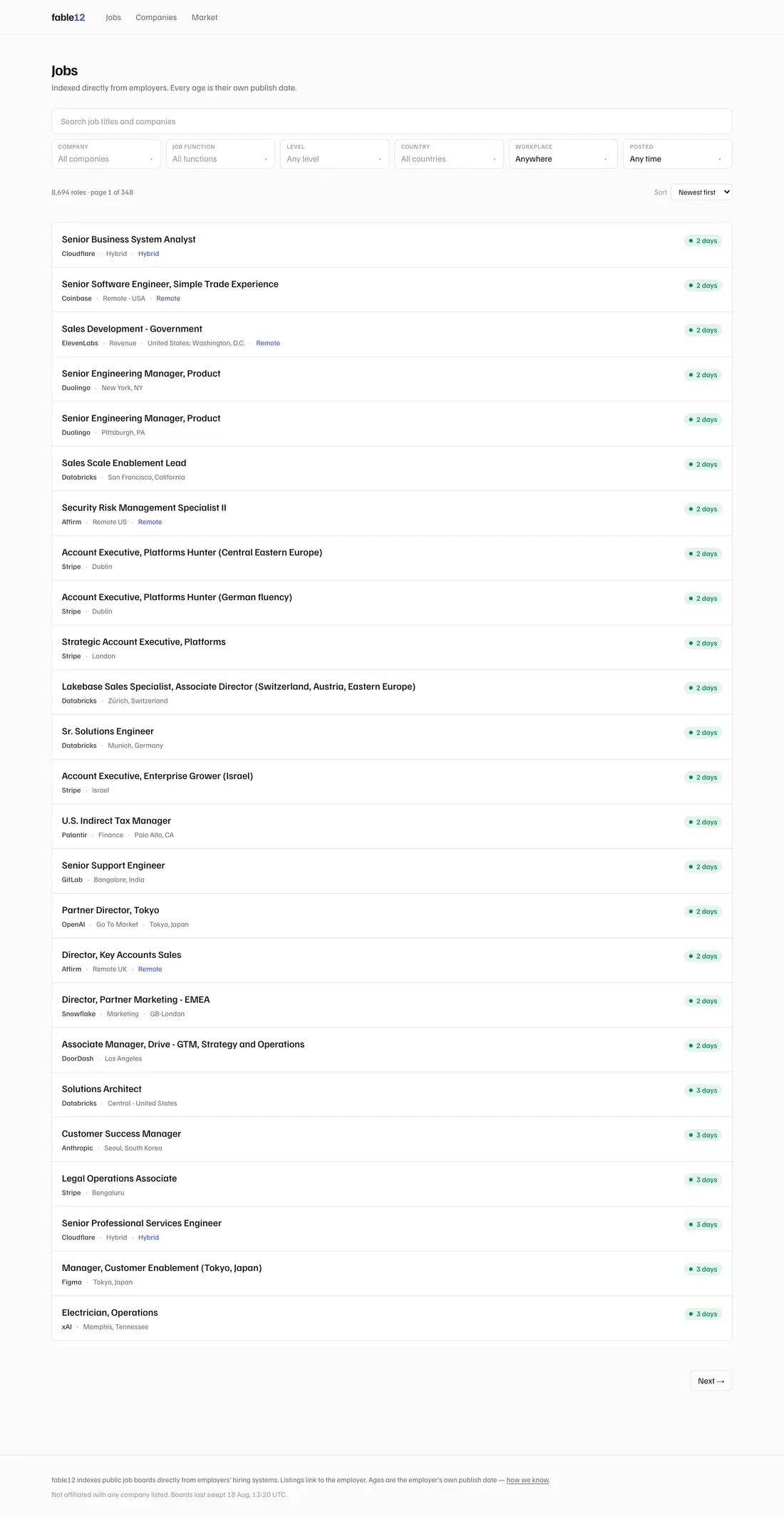
The age sat in a small pill at the far right of each row — after the title, the employer, the department and the location. Last in reading order, on a site whose entire claim is that this number exists.
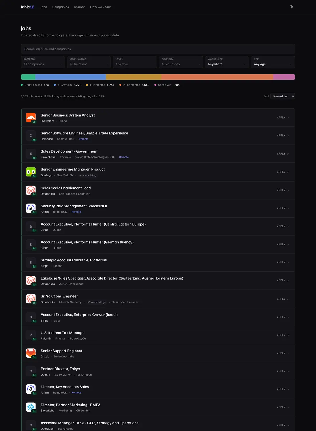
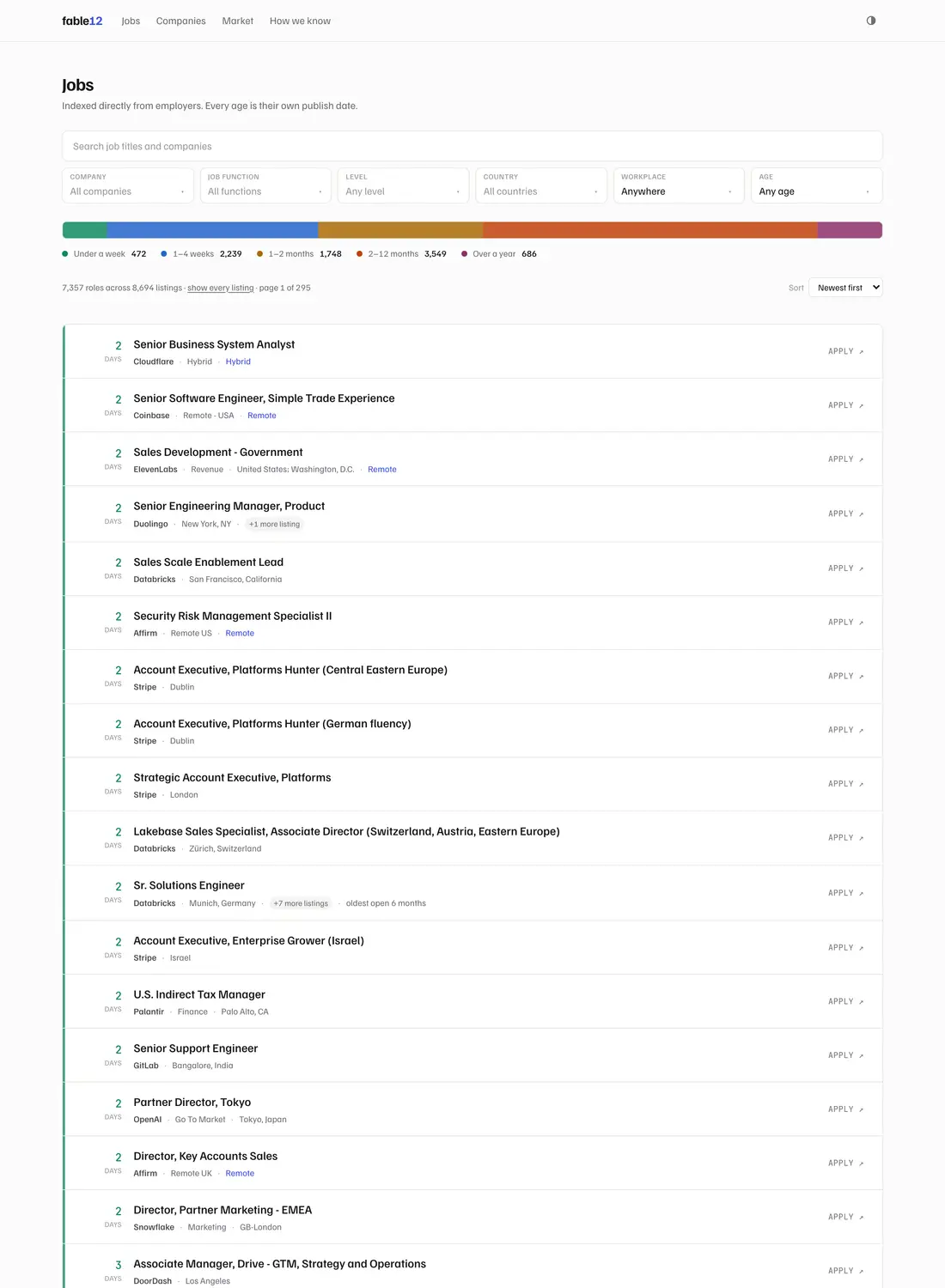
So it moved to the front. Age got a fixed gutter on the left, set in mono, coloured by band, with a coloured rule running the full height of every row. Twenty-five of those stack into a continuous column, and a page of results tells you how stale the set is before you have read a single title.
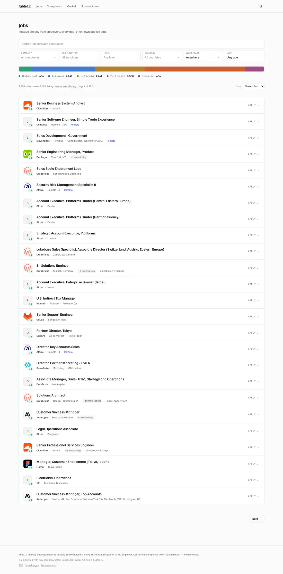
Everything else followed from taking that seriously:
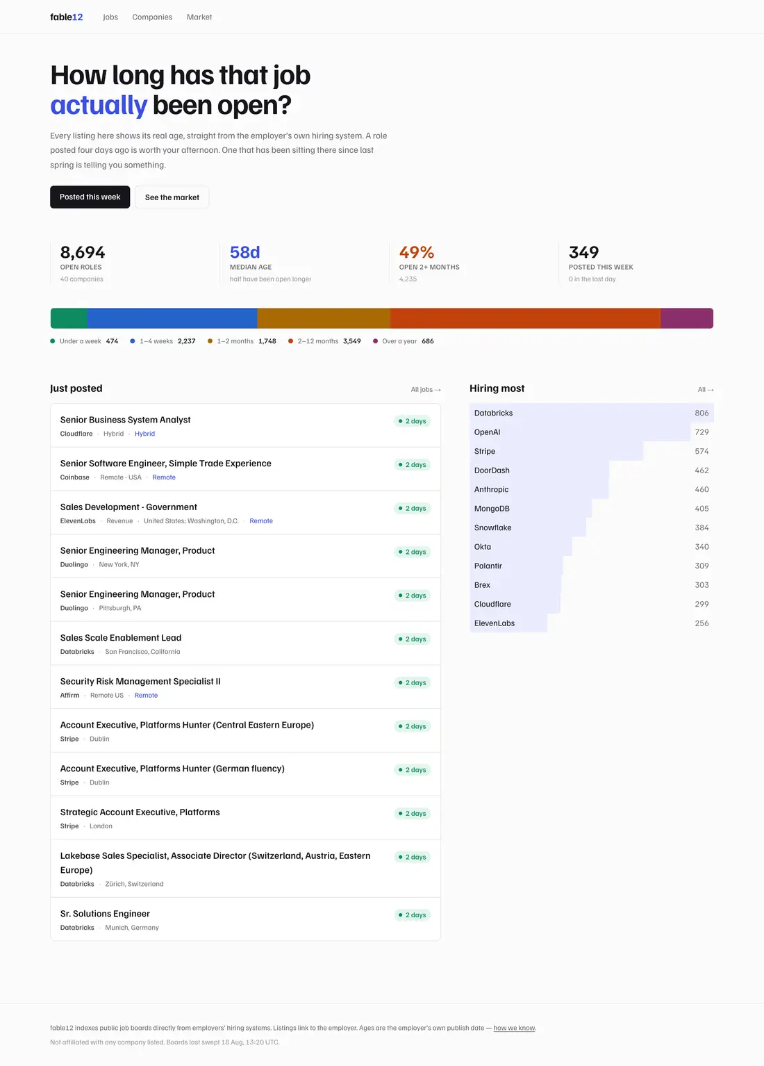
- The distribution bar became a control. It had been the clearest artefact on the site and completely inert. Each segment now navigates to that band — which finally gave the site an answer to its own headline question.
- Duplicates collapse. A quarter of the corpus was the same role repeated: MongoDB’s Enterprise Account Executive ×23, Databricks’ Solutions Architect ×19, Apple’s US-Technical Specialist across thirty-six rows. Grouped by employer and title, 68,340 listings became 55,188 roles — about a fifth of the list collapsed, with the count and location spread kept.
- The title links inward, to fable12’s own page. Applying is still one click, but it is now a labelled control rather than the accidental consequence of clicking the most obvious thing on the page.
- Relevance ranking, because sorting a text search by date is what put a Senior Fiber Technical Business Developer on the first page of “product manager” — it matched on a department string reading
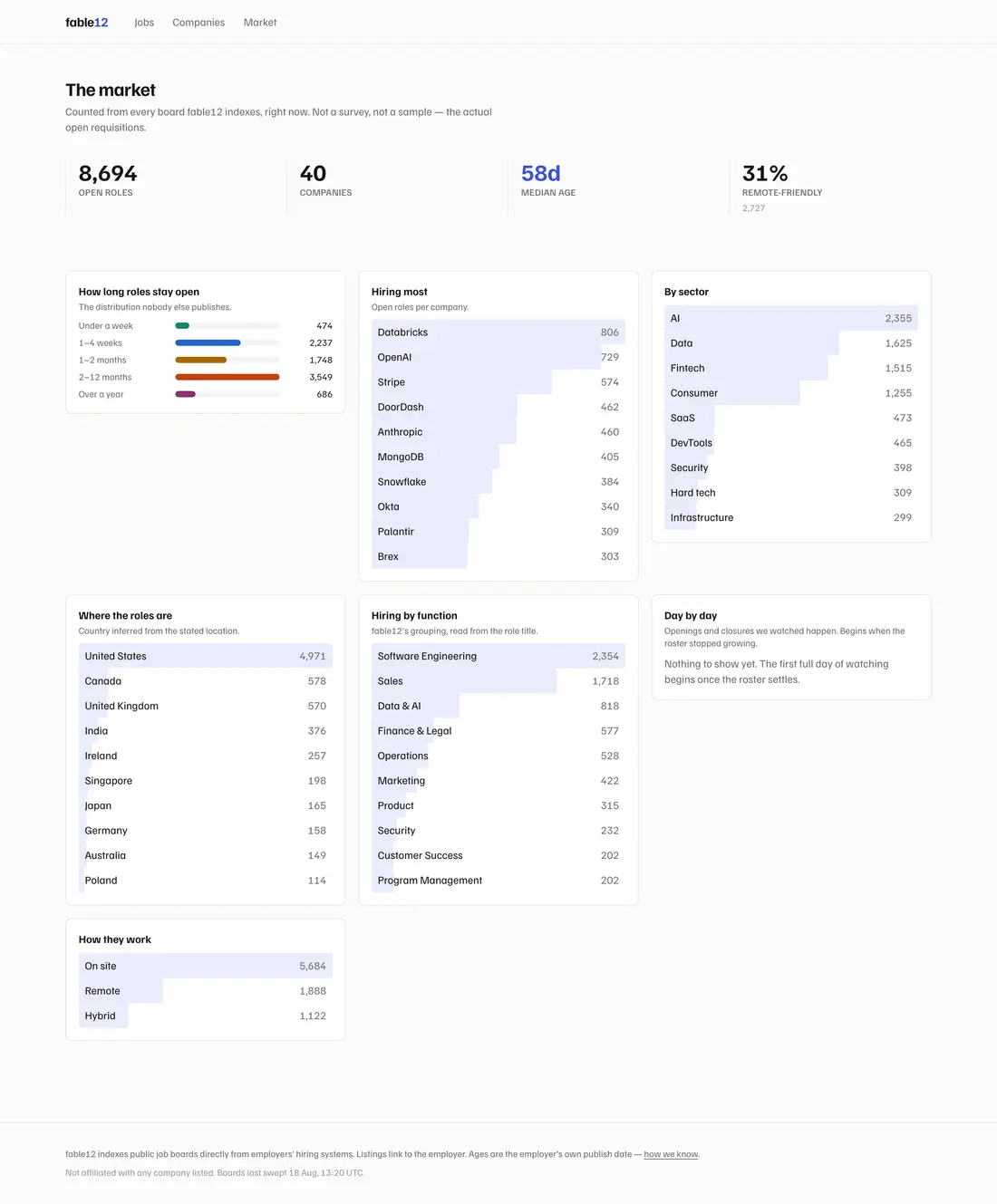
Project/Program/Product Management--Technical. - Median age on every company card, a searchable employer index, share cards on four more routes, a dark-mode toggle for a dark mode that was fully built and had no control, and a page for the site’s own headline claim.
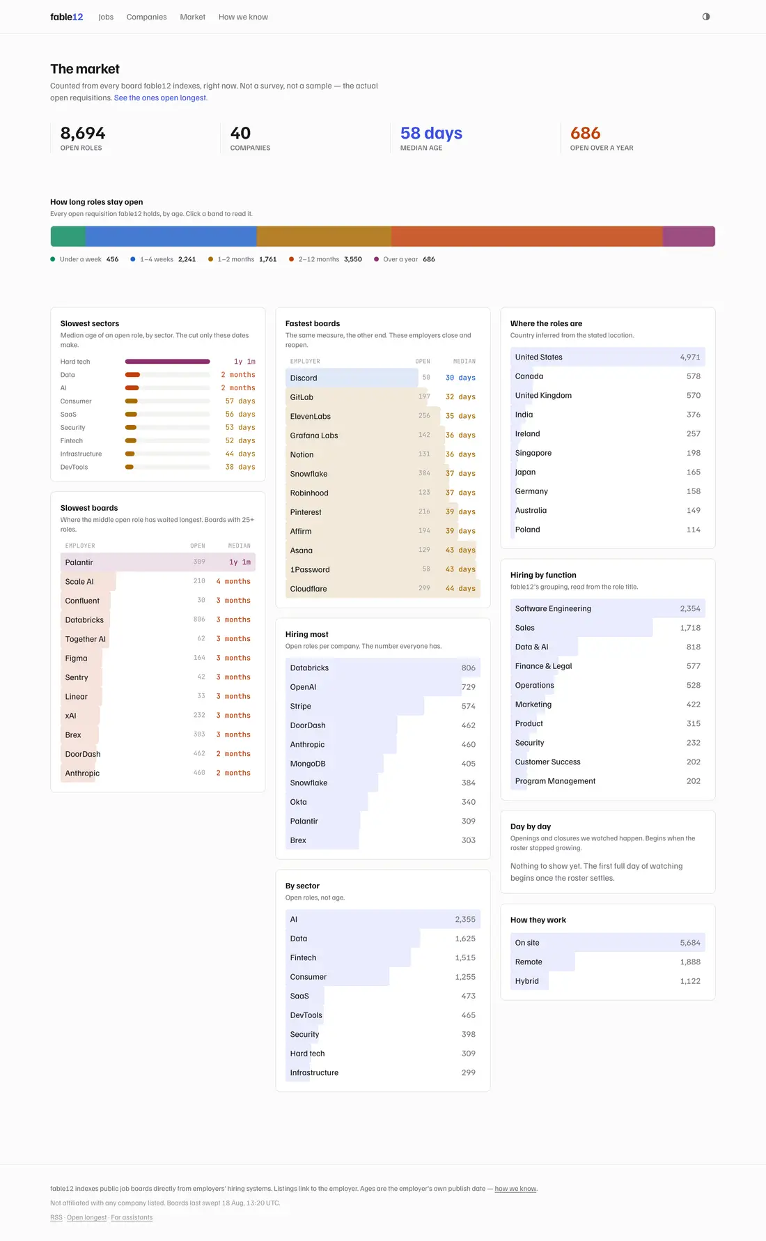
Building the market page produced a finding that did not previously exist as a view: median age by sector. The spread turned out to be the most surprising number in the corpus — hard tech at a 394-day median against DevTools at 38, a 10.4× difference end to end.
The critique, which was right
Round one was reviewed independently by the project’s owner and by a second model, and both landed on the same objection without conferring. The thesis I had written down was:
It was a job board that annotated age. It is now an instrument for reading age that happens to list jobs.
Which is a thesis for a data product. Nobody wakes up wanting to know the median age of requisitions. They want a role worth their afternoon. Put plainly: the redesign had optimised for a post rather than for a product, and replacing “Hiring most” with “Slowest boards” had traded a question a job seeker asks for one an analyst asks.
That is a hard note to take about work you have just finished, and it was correct. The corrected version is one word different in structure and completely different in consequence:
Age is the mechanism, not the subject. The promise is that this job board refuses to waste your time.
What round two actually changed
Mostly it changed what leads. The age spine made its point and made every row open with a number. But a person scanning a job list recognises a company before they read a word — so the employer’s mark now leads each row and the age hangs off its corner as a badge. The signal survives; it stops being the subject.
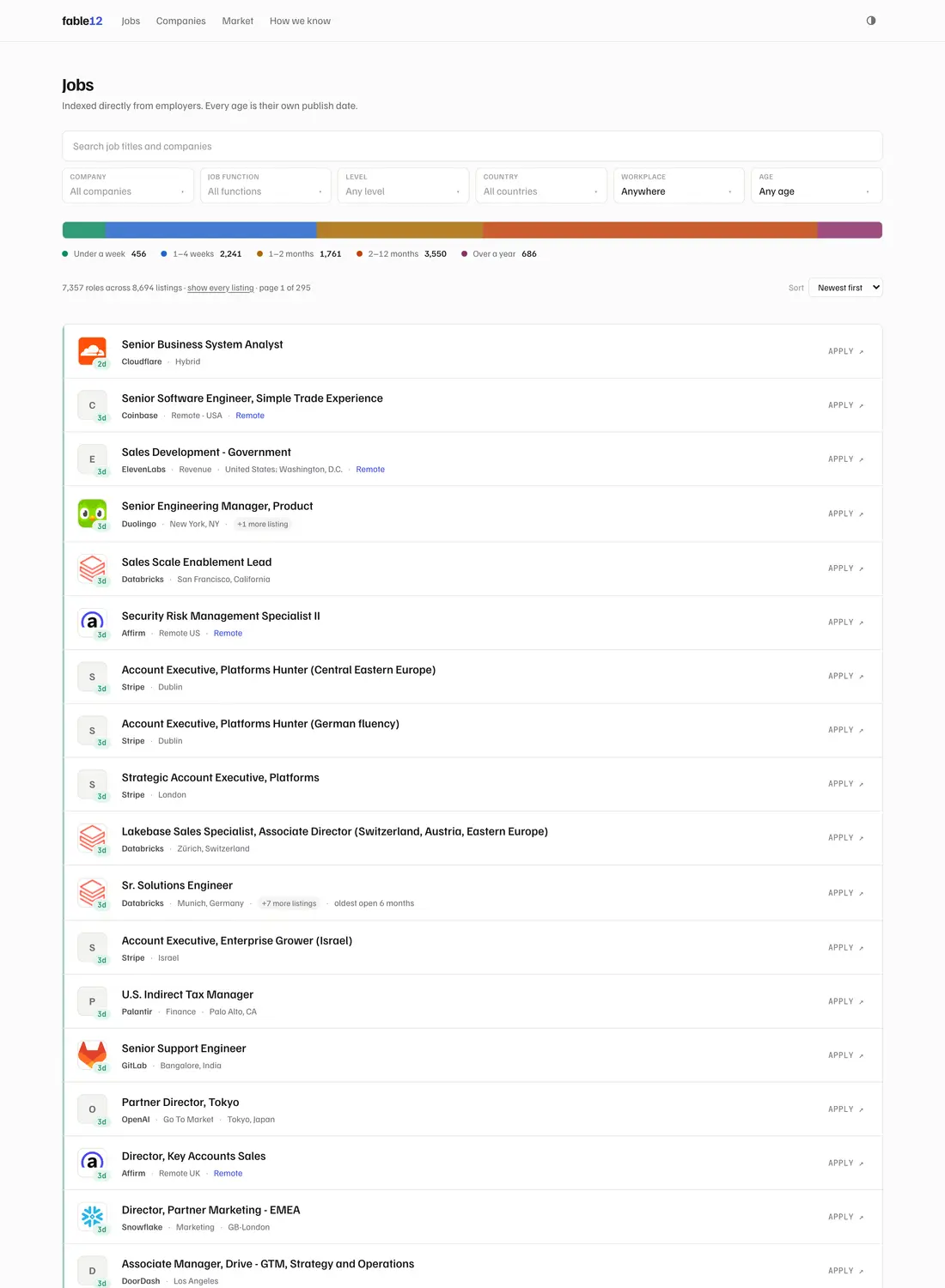
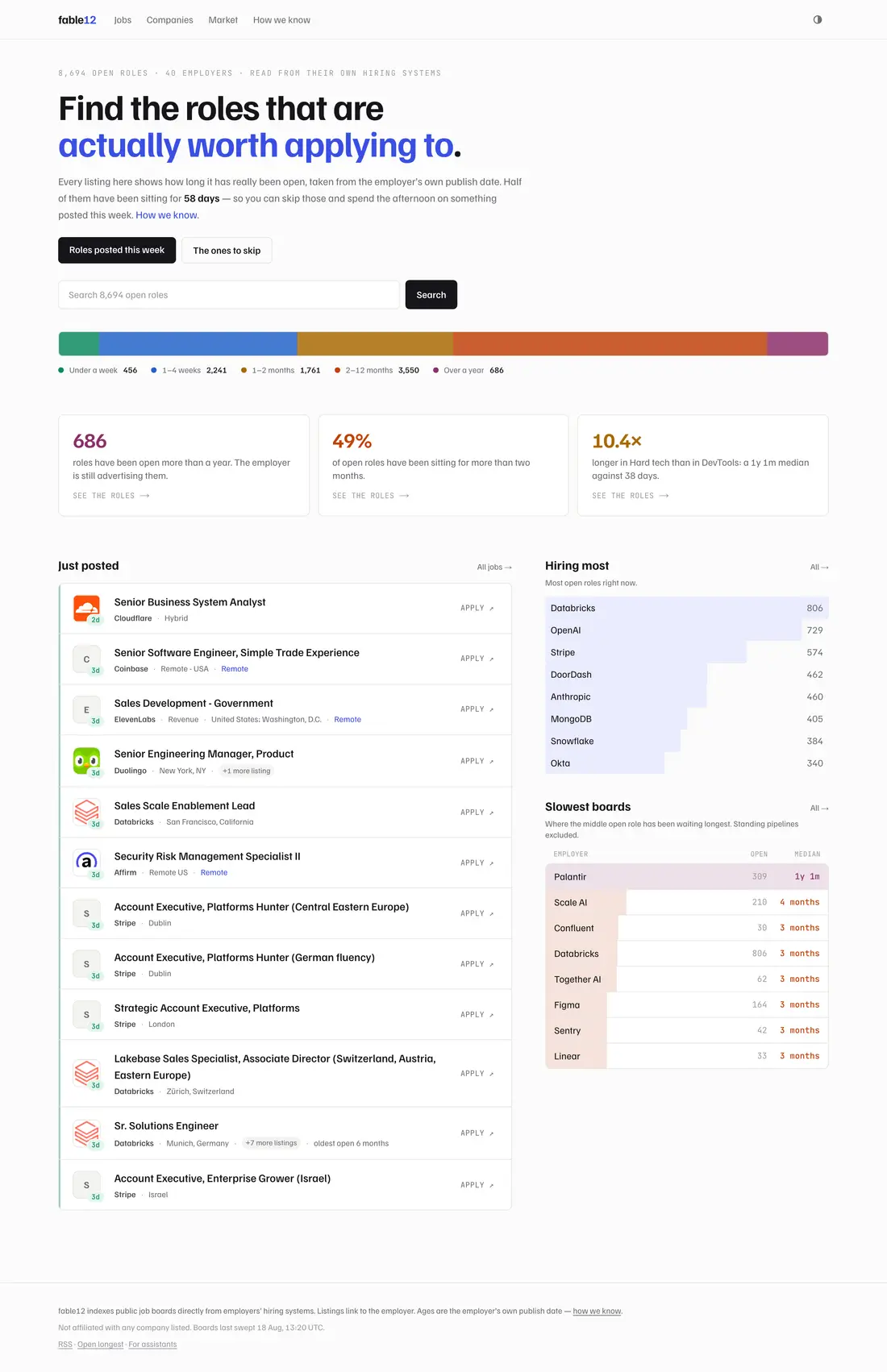
The homepage stopped diagnosing and started promising: the headline offers to find roles worth applying to, with the median underneath it as evidence rather than as the pitch. “Hiring most” came back beside “Slowest boards” instead of being displaced by it.
A ranking that was quietly making an accusation
Round two also caught a methodological error, and it is the one I would most want someone to take from this piece.
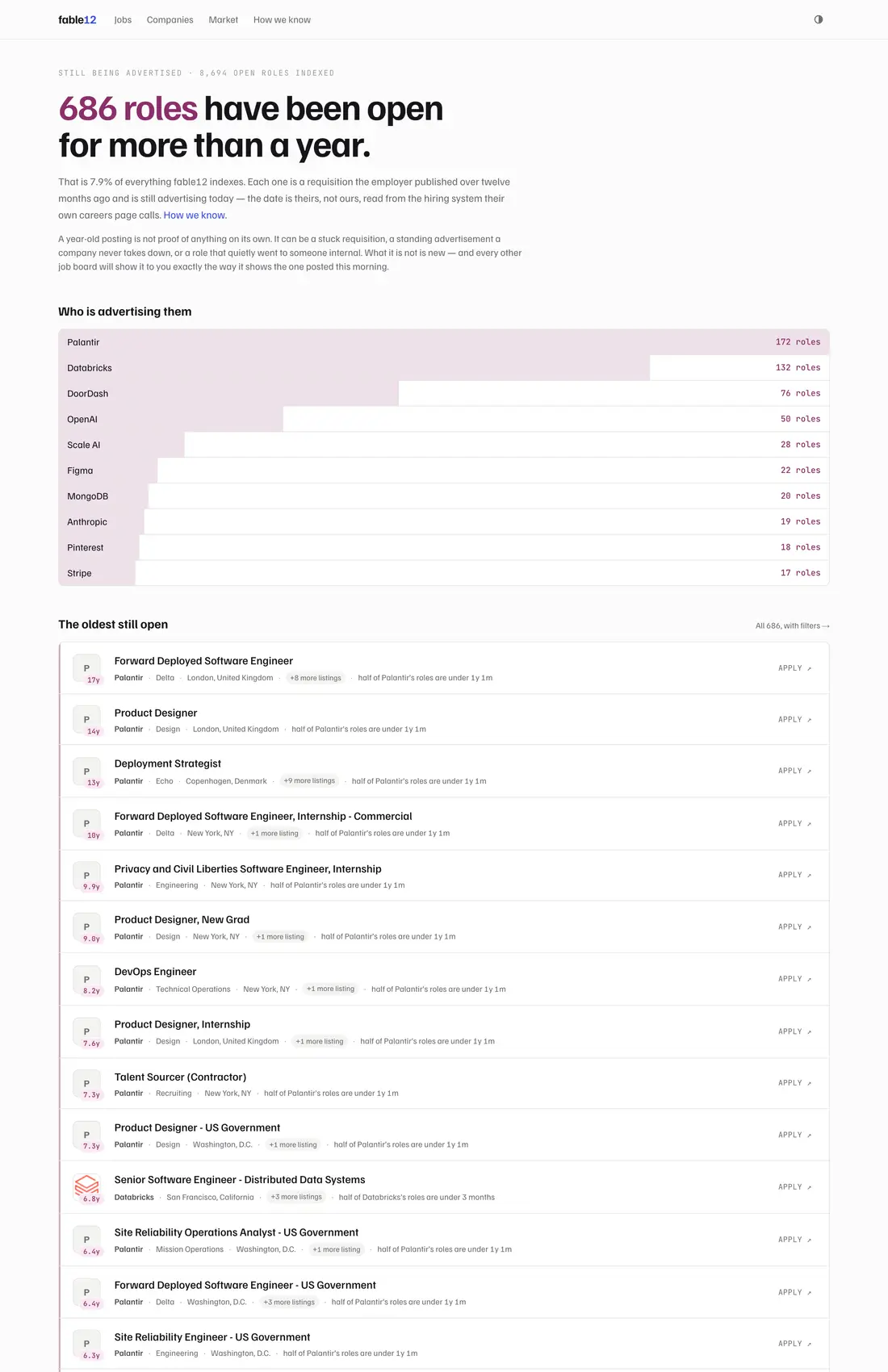
“Slowest boards” ranked employers by the median age of their open roles — and included standing requisitions: the continuous-hiring pipelines a company never intends to close. Palantir’s perpetual Forward Deployed Engineer advert and Apple’s retail pipelines were being counted as slowness. The corpus has always distinguished the two; the ranking was ignoring the flag.
This matters because the label is an accusation. Publishing “slowest” against an employer doing something entirely reasonable is the kind of mistake that is hard to take back, and it would have been made by a statistic that was arithmetically correct the whole time. Both the board median and the sector median now exclude standing roles, and a board with nothing but standing roles reports no median at all — which is the honest answer.
Getting 386 logos without trusting anybody
“Add company logos” sounds like an afternoon. It is an identity problem wearing a visual-design costume, and its failure mode is not a missing image — it is publishing somebody else’s brand under an employer’s name, where the reader cannot possibly tell.
Every mark is fetched once and served from this site. Nothing is hotlinked from a favicon service — the same rule the job data follows, for the same reasons: a third party between the site and its own pages can be rate-limited or switched off (Clearbit’s logo API, which every project like this used to call, no longer exists), and hotlinking would hand every reader’s IP to whoever runs it.
The hard part was never the image. The registry stores an ATS token, not a domain, and only eleven of the first forty employers examined put their own hostname in their job URLs. So a domain has to be guessed — and a wrong guess publishes another company’s brand.
The first run did exactly that. It accepted sentry.com, which is Sentry Insurance, a commercial lines carrier whose page title obligingly contains the word “Sentry”. That is the same failure the registry already records for board tokens — the wise token once served a US insurance field-sales outfit. Liveness is not identity, and neither is a matching word.
So a domain has to earn the right to supply a mark:
ats-board   the employer's own ATS board page — the token is already verified,
            so whatever it displays belongs to them by construction
job-url     the employer's own listings name the domain — nothing to prove
board-link  the site links to this employer's board, host and token together
name-only   a matching name and nothing else — accepted, recorded as unproven

Rejected outright: a multi-word company matched on only its first word.
  "Black Forest Labs" -> black.com   "Commonwealth Fusion Systems" -> commonwealth.com
The top tier is the one that changed the outcome, and it was sitting in plain sight the whole time. Every employer here already has a board token that was verified against the live board — that verification is what allows us to publish their jobs at all. And that board page hosts their logo. Identity is proven by construction; no guessing is involved. Coverage went from around 240 marks to 326 of 386 employers, and it corrected several that were already wrong — Braze, Brex and Crusoe had been showing marketing banners scraped from their homepages.
Where identity still cannot be proved, nothing is published and a monogram is drawn instead. An initial is always right; somebody else’s logo is not.
A later pass took it to 365 of 386, and the interesting part is what the remaining failures turned out to be. Almost none of them were “we cannot identify this company”. The resolver guesses {name}.com, and Datadog is datadoghq.com, Wiz is wiz.io, Block is block.xyz, Hugging Face is huggingface.co. Another whole class was one line in this file’s own comments that had sat there as a known limitation: sharp cannot decode ICO. Amazon, Dropbox, Oracle, SpaceX, Ripple and Hugging Face all publish a perfectly good icon inside one, and unwrapping the container — a six-byte header and sixteen-byte directory entries around either a PNG or a headerless BMP — recovered fourteen marks that had never been missing at all.
The twenty-one still without one are sites that answer 403 to anything that is not a browser, or whose only icon is 32 pixels or a sixteen-colour palette. The monogram is the better answer there, and it is the answer the pipeline is designed to fall back to.
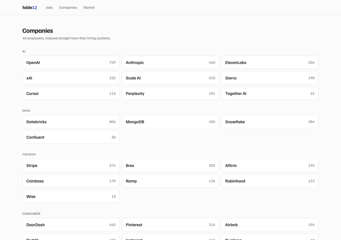
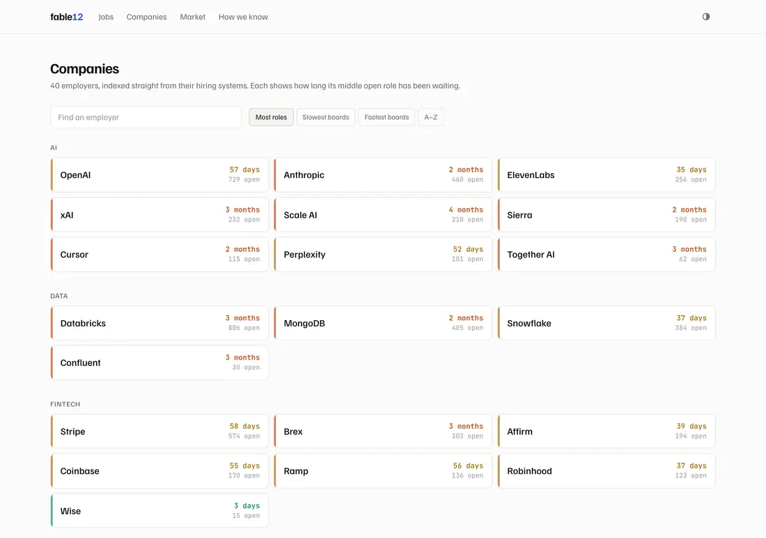
Why looking at the pictures is a pipeline step
Automation gets you most of the way and not all of it. A contact sheet of every fetched mark caught ro.com serving an anime fan site, physicalintelligence.com serving a fitness studio, and three separate companies sharing one “MARK UPGRADE” placeholder page. Eleven wrong domains are now recorded permanently so no later run can make the same call.
And two that passed every mechanical check:
- Qualcomm’s web manifest serves the default Create React App logo — the blue React atom — at a perfect 512×512. Right size, right format, correctly declared, served from the right domain.
- Coursera’s board logo is a co-branded “coursera + udemy” image. Correct provenance, correct company, still the wrong thing to print beside a job.
Two mechanical notes for anyone building the same thing: sharp cannot decode ICO at all, so every employer offering only a favicon.ico produced nothing; and several sites answer 403 to anything that is not a browser. Both classes serve /apple-touch-icon.png perfectly well without mentioning it in their HTML, so the pipeline probes for it.
Four defects found after it shipped
The rebuild deployed, and a deliberate pass over the live site found four things. None would have been caught by a test suite — 652 assertions pass and caught none of them.
1. Job titles opened behind the header
Opening a listing from a scrolled results page landed at y=97 every time, putting the role title underneath the 57px sticky header. One line of CSS:
html { scroll-behavior: smooth; }It was animating the scroll the router performs on navigation, and the animation did not finish. The bug had existed all along and was invisible while titles led off-site; it appeared the moment they started navigating inward. A redesign does not only add bugs — it exposes the ones already there.
2. The employer search collapsed to 26 pixels
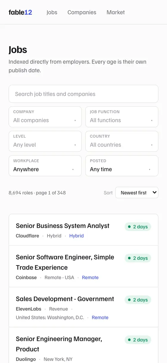
At 390px the search field on /companies shared a row with four sort chips and was starved to 26 pixels — narrower than its own placeholder, and overlapping the first chip. Nothing catches this except opening the page at a phone width.
3. A text colour that failed contrast
The faintest text token measured 2.72:1 against its background, under the 4.5:1 WCAG AA requires — and it carried real content: counts, dates, the footer.
| Theme | Before | After |
|---|---|---|
| Light | 2.72:1 | 4.57:1 |
| Dark | — | 5.83:1 |
4. The site disagreed with itself about a year
A badge read 12mo where that listing’s own page read 1y. Two formatting functions switched from months to years at different thresholds — one at 365 days, the other at 730.
Cosmetically the smallest of the four; in substance the worst. On a site whose entire proposition is that its numbers are exact, two of its own numbers disagreeing about the length of a year is not a rounding bug. It is the central claim failing in miniature, in front of a reader who now has no reason to believe the other numbers either.
The critique I have not answered
A separate teardown made a sharper point than anything above, and it is still open. An old publish date can mean at least four different things:
- an evergreen pipeline requisition the employer never intends to close;
- a genuinely hard-to-fill role;
- a requisition reused across several hires;
- a dead listing nobody cleaned up.
The first two are reasons to apply. The last is a reason not to. They all render as the same alarm-coloured badge. Excluding standing requisitions from the rankings addresses one of the four; the rest are unresolved, and the honest position is that age is a real signal being read slightly too literally.
The same teardown produced a finding I keep thinking about: on one employer’s board, 99 of 475 requisitions are older than six months — and the employer had touched every one of those 99 within the previous 30 days. The whole board resolves to just fourteen distinct update dates, which looks like a bulk refresh rather than human attention. Age says one thing; the edit pattern says another.
The strongest suggestion from the review is the one I would build next, and it needs no new data source: repost detection. A company that closes a requisition and posts it again three times is a far better signal than age alone, and it helps a reader decide rather than only an analyst. The corpus already never deletes and already tracks reopening, so the foundation is there.
Email alerts were ranked above SEO by the review, as the only loop that turns an episodic need into a returning one. They remain deliberately undone: they are the first feature that would require this site to hold personal data, which it currently does not do at all. The feed takes the same filters the listing page does, so a saved search exists without an account, an address, or anything to lose.
The machinery under all of this — how 68,000 listings get dated in the first place, and the eleven different ways a hiring system can be wrong about a date — is its own note.